SPARC
Brand Redesign
Idenitifying the Issues
SPARC, or Shakespeare & Performing Arts Regional Company, is a unique theater company that merges the art of live performance with the atmosphere of a vineyard. By staging productions in this scenic setting, SPARC creates
an experience that blends a love for theater with an appreciation for fine wine. In addition to their mainstage performances, they offer children-focused programs designed to introduce young audiences to acting and nurture their passion for the arts.
During the COVID-19 pandemic, the theater company underwent a rebranding to SPARC, which led to a shift in its identity and the loss of some of its original audience. While its roots are
in Shakespearean theater, SPARC has grown into something much more—offering a diverse range of performances, programs, and community-driven projects that extend beyond
a single location. The challenge is to communicate this evolution in a way that sparks interest and excitement while maintaining
a sense of warmth, inclusivity, and belonging. SPARC is not just
a theater company—it’s a vibrant, inviting community where the love of performance and storytelling continues to thrive.
Client’s Goal and Audience Considerations
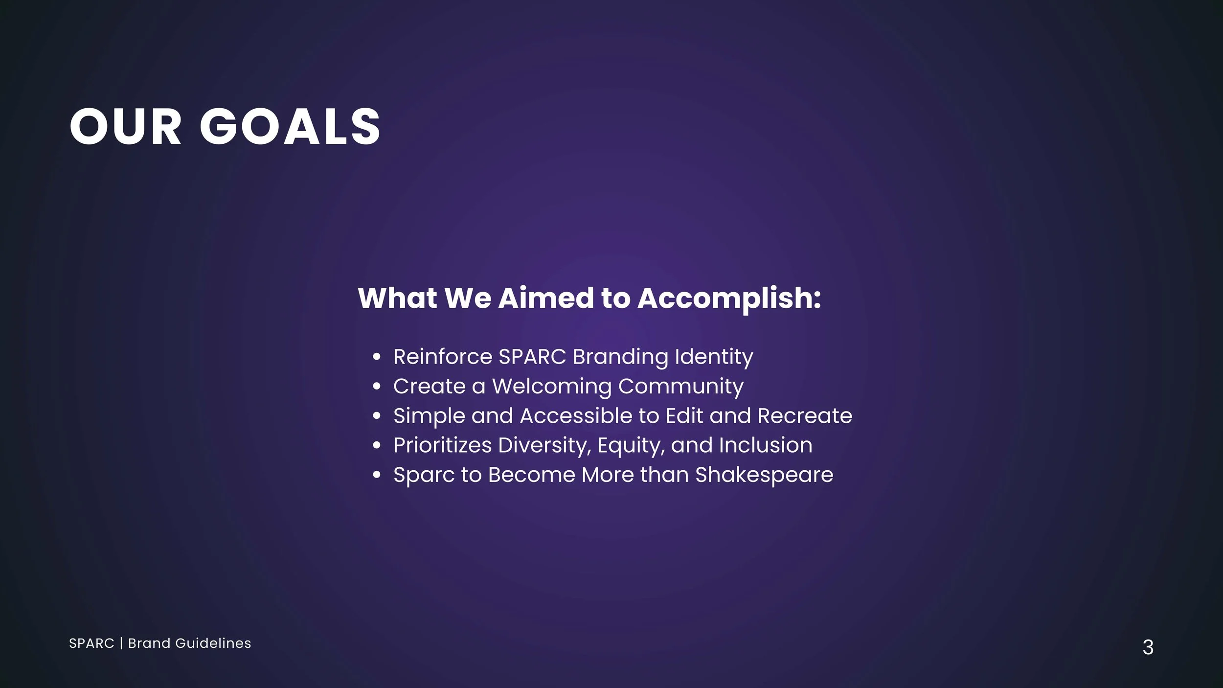
SPARC’s goal is to reconnect with its original audience while expanding its reach by fostering a strong, community-driven theater program. Establishing solid branding is key to highlighting the company’s diverse range of productions and educational initiatives beyond Shakespeare. The theater aims to inform audiences about its rebranding, showcase
its variety of programs, and create an engaging, inviting atmosphere that encourages participation and support. SPARC’s primary audience includes adults in their mid-30s to mid-40s with stable incomes, particularly in the Livermore and Tri-Delta areas, many of whom have children and a background in higher education. Additionally, SPARC caters to literature-focused children (ages 6-8), donors (ages 35-60), and commuters (ages 25-49). Psychographically, its audience values community engagement, supports local businesses, and seeks enriching experiences for themselves and their families. As people look for ways
to reconnect post-pandemic, SPARC aims to be a welcoming space that inspires, educates, and entertains.
Credit: Caroline Rivera
New Branding Guidelines
For the SPARC rebranding, I collaborated with Caroline Rivera, Asher Bloom, and Arina Kelekhsaeva to refine and modernize the brand identity. Together, we established updated branding guidelines, determining which design elements needed
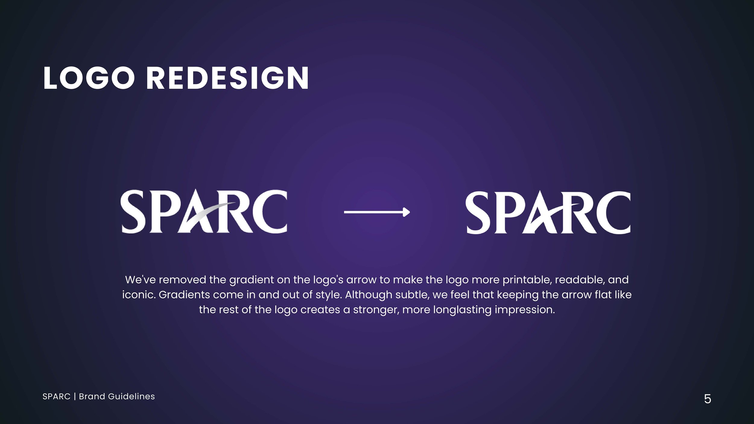
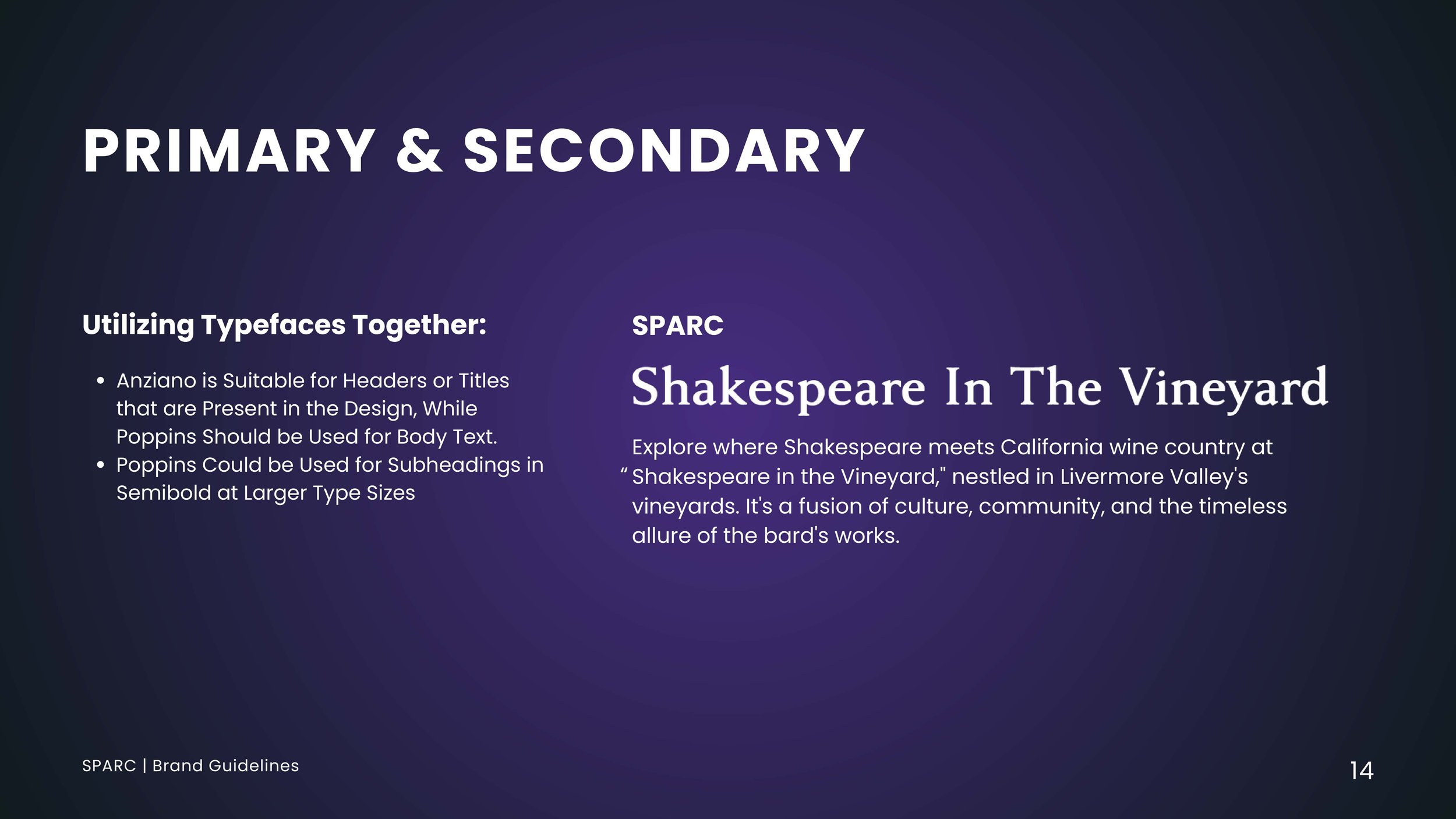
to be reworked or added. Our first priority was simplifying the original SPARC logo—removing the gradient in favor of a solid color for a cleaner, more cohesive look. For typography, we selected Anziano for headers, as its serif style created a theatrical yet timeless feel, and paired it with Poppins for body text to maintain an approachable and family-friendly tone. The color palette was streamlined to three core colors: red, yellow, and purple. This shift moved away from the original, overly broad palette that leaned too heavily on light blue, which gave off a tech-company aesthetic. To differentiate SPARC’s programs, we created two variations: a bright, pastel-infused palette for children's programming and a red-and-yellow-focused scheme for Shakespeare productions, evoking a vintage theatrical feel. For imagery, we integrated gradients
to create a more dynamic visual language that aligned with the new guidelines. Additionally, hand-drawn contour line illustrations featuring theatrical motifs were incorporated into the background of adult-focused materials, reinforcing the company’s artistic identity. These thoughtful design choices brought cohesion and character to the SPARC brand, ensuring it resonated with both young audiences and seasoned theatergoers.
Designing Assets
During the redesign process, one key requirement was ensuring that all design elements were simple to integrate and easily recreatable for future productions. To achieve this, we opted for contour line drawings, allowing for broad, versatile illustrations that could be applied across a variety of plays. I created three distinct contour line drawings that maintained this flexibility while reinforcing the theater’s artistic identity. Additionally, I designed the dotted line elements for the children's program, which not only made the designs easy to incorporate into other materials but also added a playful and engaging touch to the program’s visual identity.
Informational Documents
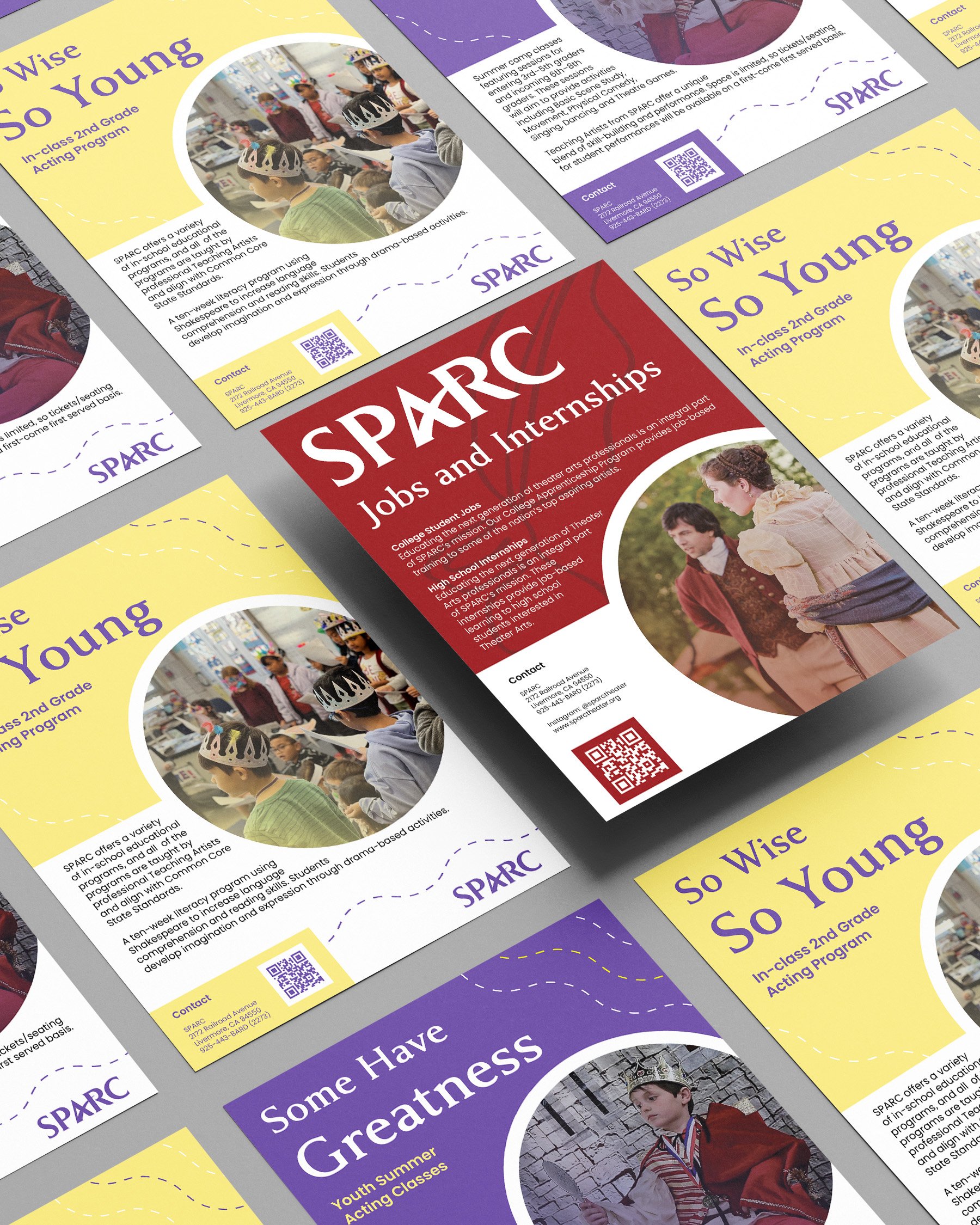
Informational documents played a crucial role in the SPARC rebrand, providing context about the organization’s mission, entertainment offerings, programs, and job opportunities. It was essential to present this information in a visually appealing yet easily digestible layout. I designed a trifold brochure for SPARC’s children-focused programs, as it needed to accommodate details about both summer and in-school offerings. For the adult-oriented SPARC plays, I created a bifold brochure, which contained less information and was designed to serve as a clean, professional introduction to the company. Additionally, I designed two flyers for the children’s programs and one specifically for adult job and internship opportunities, ensuring all materials aligned with the new brand identity while remaining clear and engaging.
Spread the Word
Expanding SPARC’s reach relies not only on marketing but also on word-of-mouth from current patrons. Encouraging customers to talk about the theater helps attract new audiences, and one way to facilitate this is through eye-catching merchandise that sparks curiosity and conversation. To achieve this, I designed a bold tote bag that prominently features actors and the SPARC name, emphasizing the theater’s connection to performance. The design uses a single color to keep production costs low while maintaining visual impact. Additionally, I created a set of three button pins incorporating the brand’s colors and contour line drawings. These designs are intentionally more subtle, encouraging curiosity and inviting questions about SPARC, ultimately serving as conversation starters that further promote the brand.
Other Branding Material
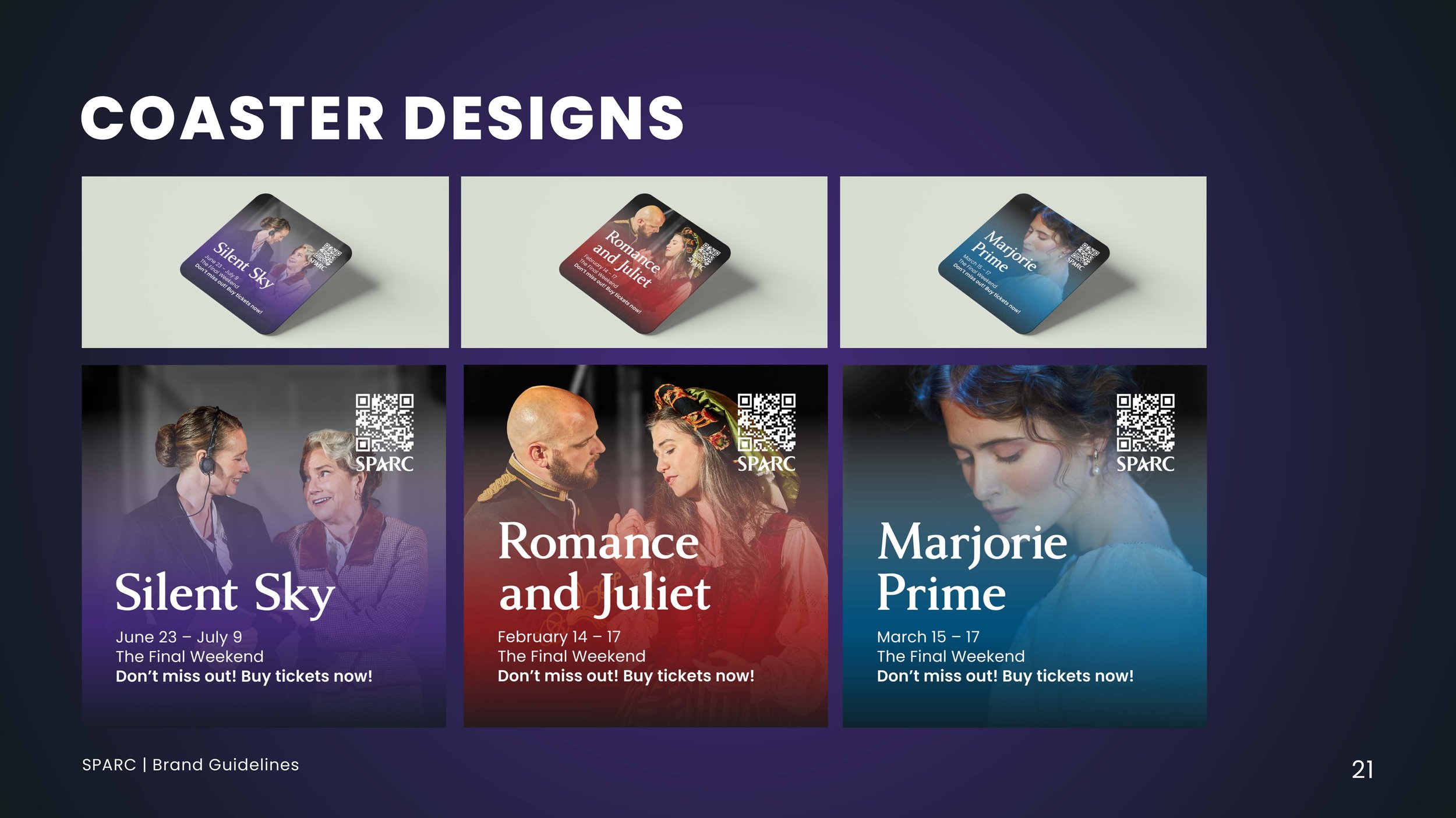
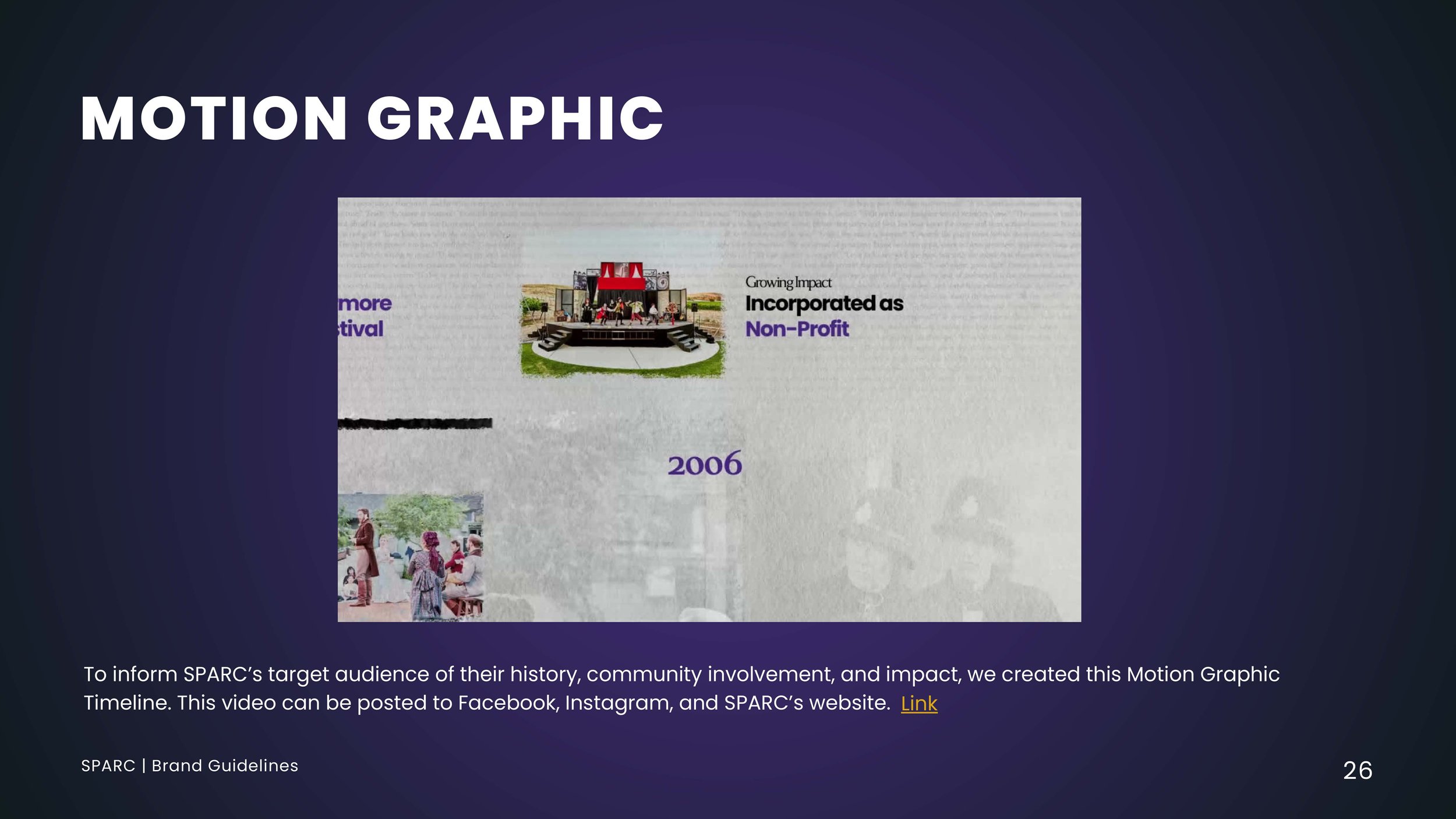
I was not the only one contributing to the creation of new materials for SPARC’s rebrand—our entire team played a vital role in expanding and refining the brand’s identity. Each member developed assets that highlighted SPARC’s dedication to theater while helping to attract a broader audience. These materials included social media posts, motion graphics, and coasters, all designed to strengthen SPARC’s presence. Through our collective efforts, we provided the organization with a comprehensive set of assets that not only reinforced its theatrical focus but also helped rebuild its audience after losses experienced during the pandemic.
Credit: Caroline Rivera
Credit: Caroline Rivera
Credit: Caroline Rivera
Credit: Caroline Rivera
Credit: Asher Bloom
Rebranding Pitch
After completing the rebranding materials, my group member Caroline Rivera and I developed a presentation to pitch the rebrand. In our presentation, we showcased the new designs, explained our creative decisions, and highlighted how these updates would strengthen SPARC’s identity and outreach. This allowed us to clearly communicate the vision behind the rebrand and demonstrate how the new materials aligned with SPARC’s goals.


